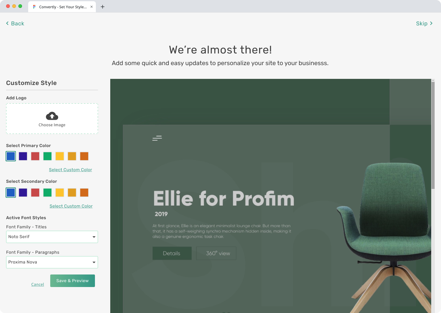
Website Creation Wizard
Create a simple wizard for small to medium-size businesses to build their site in minutes.

Overview
Convertly: CMS linking small & medium businesses to online branding and marketing. User-friendly platform for fast, responsive websites. I’m the sole Product Designer.
Problem
After account creation, a new site is generated from a base template. Then, customization with colors, branding, fonts, and imagery is needed. Business owners often relied on Convertly internal resources, lowering adoption and renewals.
Goal
Design a user-friendly wizard for easy website creation, empowering users to customize with logos and colors, boosting platform familiarity, adoption, and satisfaction.
My Roles
- User Research
- User Testing
- UI/UX Design
- Prototyping
- Content
Timeline
2 weeks
+50% Renewals
Website and adbuy renewal rates were increased due to quicker adoption rate and overall positive engagement with the application.
01
Discovery
How I got started
- Reviewed competitors such as Wix, Weebly, SquareSpace, GoDaddy, and others.
- Sought inspiration from platforms with similar user interfaces.
- Identified design patterns for implementation.
What I Discovered
- Streamline user access: Reduce steps to the dashboard to 3-4 by implementing preset templates, color schemes, and content.
- Minimal decision-making: Provide preset options to simplify choices and expedite user entry into the tool.
- Facilitate website preview: Enable users to quickly view the beginning of their website upon accessing the dashboard.
02
Discuss & Define
Now’s a good time to use the knowledge we’ve gained and come up with a solid plan to reach our goals. Let’s focus on understanding and tackling the issues we’ve pinpointed by diving into some deep analysis and discussion.
- Present Discovery findings to the stakeholders and team
- Collaborate on User Journey Mapping in FigJam
- Generate User Flows
- Create Action Items/Stories
03
Design
Once aligned with the team, I shifted to Figma. Aim: Design a tool for users to craft a site in <5 minutes, easing adoption.
- Option for Single Sign On (SSO) with Google or Facebook
- 1-2 questions to generate website template options
- Simple page to allow easy branding selection and logo uploading
- Drop them right into the edit tool with the onboarding video
Mockups
Source Files & Prototypes
Mockups and Prototypes were created in Figma. These files were copied over from the work account. Files and projects would normally be organized differently.
- Figma Source Files – Link to my Figma Files.
- Interactive Prototype – view prototype in Figma
Outcomes & Lessons
Reduced Internal Costs
Development resources no longer needed to manually create the websites.
Faster Setup Time
The creation of websites was reduced by 75% due to the ability of the client or sales team to create site at the point of sale.
Increased Renewal
Website and adbuy renewal rates were increased by 50% due to quicker adoption rate and overall positive engagement with the application.


