FinTech Design System
Create a scalable foundation for new internal portal for large FinTech/Investment firm.

Overview
I created a comprehensive design system for a FinTech company’s internal dashboard. The goal was to streamline their UI/UX, enhance consistency, and improve the overall efficiency of the design process. The new design system integrates scalable components tailored to the team’s unique needs, ensuring a cohesive and intuitive user experience across the platform.
Problem
Environmental assessments are currently created and managed using Excel spreadsheets. However, due to varying requirements and needs across different groups, these spreadsheets often lack consistency and standardization.
Goal
The objective was to develop a centralized portal that enables individuals to create, manage, and audit assessments efficiently. This solution aimed to enhance consistency and significantly reduce the time required for evaluating and auditing assessment validity. Additionally, the portal was designed with scalability in mind, allowing for future integration of additional tools and resources to streamline daily processes and procedures.
- Create a scalable design system
- Create MVP of Assessment form
- Move Teams out of Excel
My Roles
- User Research
- User Testing
- UI/UX Design
Timeline
6 weeks
Mockups
Source Files
Source files are created in Figma.
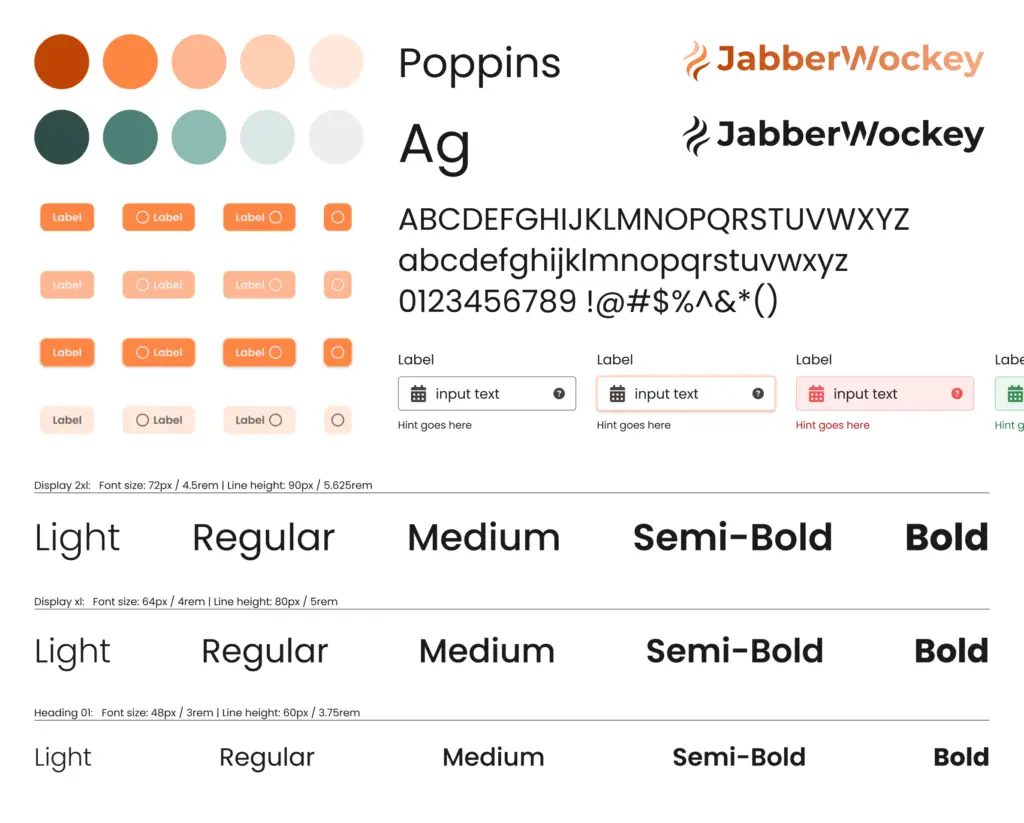
- Design System- Source – Example of the design system I created. Branding has been changed.
01
Discovery
User Research
I thoroughly review all branding and style guidelines for the consumer-facing website to ensure alignment with the overall design strategy. Additionally, I collaborate with stakeholders and product users to explore various scenarios in which assessments are created and viewed, gathering insights to inform design decisions.
02
Discuss & Define
As the sole designer, I had to balance the development of the Design System with other ongoing projects within a limited timeframe. The Design System needed to scale rapidly, necessitating a strategic approach as I continuously identified new use cases and expanded the library.
Collaborating closely with the VP of Product and the Front-End Engineering Lead, we established a set of short- and long-term priorities. Key guiding principles included rapid scalability and modularity, with a focus on meeting the tight deadline for the MVP launch. This approach often involved prioritizing reusable components and templated layouts wherever feasible. Key considerations during the design phase included:
- Make it Scalable
- Make it Responsive
- Make it Accessible
03
Design
To create a design system for a FinTech tool, I audited the brand’s guidelines and modernized colors with softer tones while keeping core colors for brand consistency. I chose a modern, legible typeface to enhance readability. This established a cohesive, user-friendly foundation.
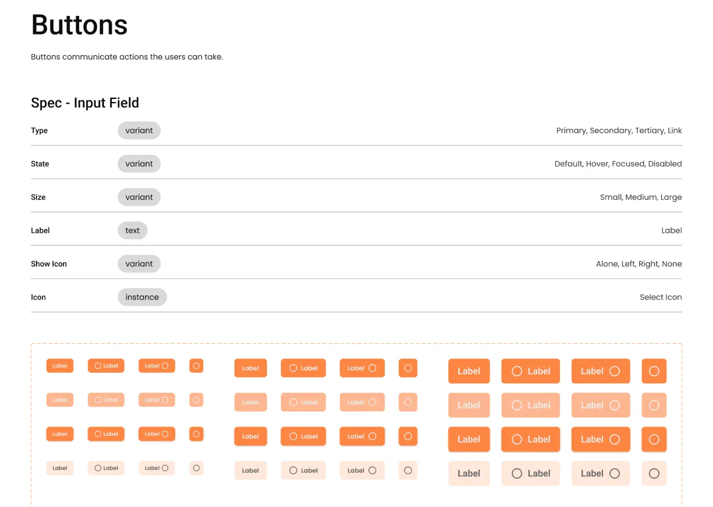
Thorough documentation is essential, so I ensured that each variable and component was clearly explained, including its significance and context of use. Additionally, I provided a comprehensive key for variables and variants, detailing their functions. This approach facilitates ease of use, enabling any team member to quickly understand and leverage the design system effectively.

I established the foundational structure by creating a series of page templates. Adhering to dashboard UX best practices, I explored various approaches to information architecture, navigation, and sidebar configurations. In collaboration with front-end engineers, we defined the grid system for key breakpoints, aligning with their implementation in Tailwind CSS.
Mockups can be found above but if you want to dig into my Figma file, that link can be found by
Clicking Here.
Outcomes and Lessons
Scalible
Started with a strong foundation that can be easily built upon by having a diverse color palette, using variables for easy update, created variable components that give them flexibility.
Responsive
Auto-layout is a great tool to keep components responsive. This allows for when they create a more mobile friendly dashboard and tools, the system will be ready to go they can create designs that meet their needs.
Accessible
Starting from scratch presented the opportunity for accessibility to be part of my process. Making sure color contrasts meet WCAG guidelines, to appropriate focus states, and clear & informative feedback
A design system is always growing. Giving it the room and features to go less painfully is key.


